
What does classic look like?
Some shops thrive on being fresh and new. Take a coffee shop for example. If it’s the new spot where everyone’s going, you’ll attract young clientele. However, what if you’re a company doing work that takes years of practice? What if your competition are people in their early retirement who know they’re craft like the back of their worn hands? How do you establish a brand that already looks well worked in, but not old? This was that experiment.


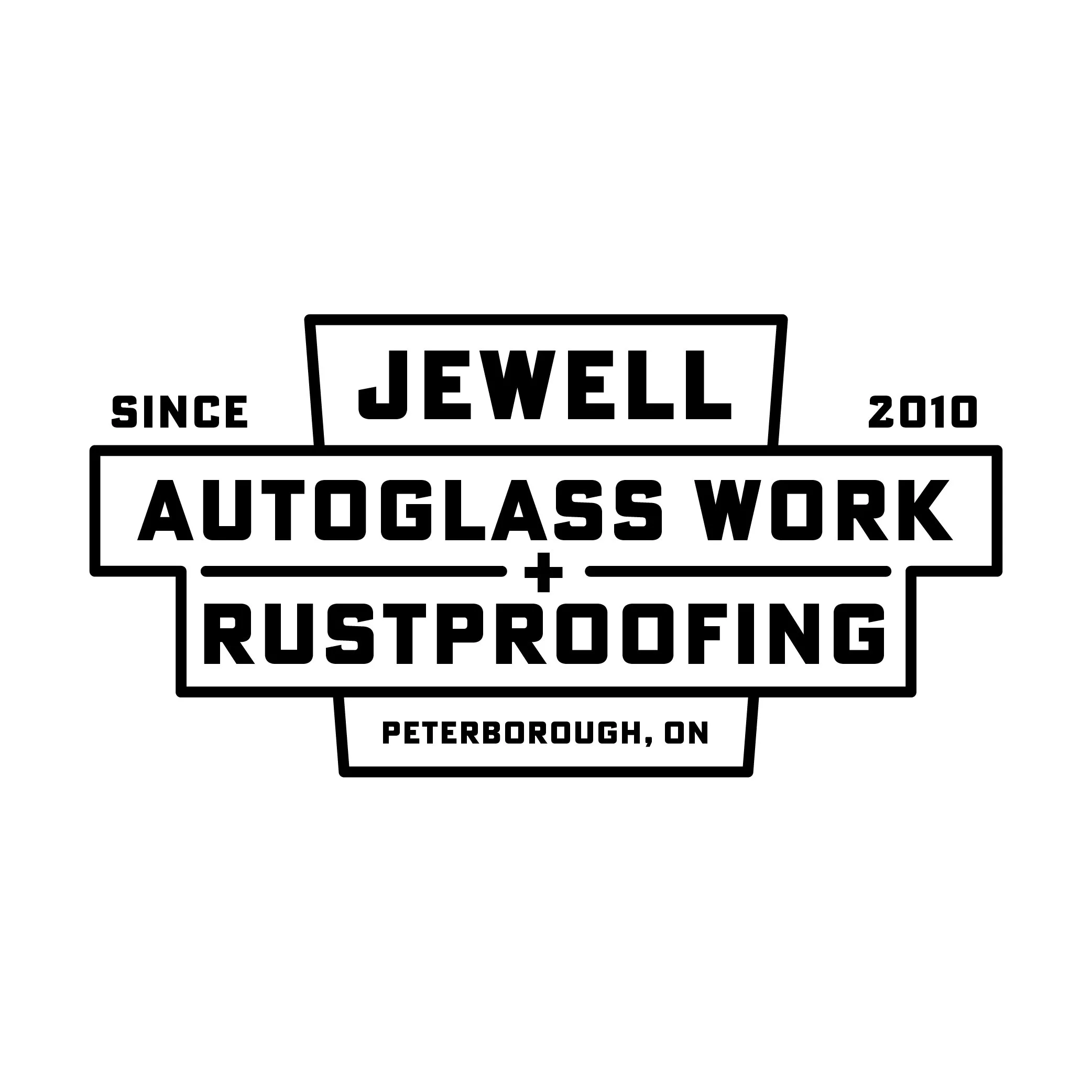
I took some inspiration from ‘60s-inspired frames and lettering. Nothing much to it, just classic serif all caps with a classic diamond illustration. I then tried something circular like vintage gas station signage, incorporating a broken windshield and the bottom half of a car. The last one, I take inspiration from classic heavily typographic signage. It’s where I personally wanted to land, although the experiment didn’t end there.
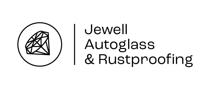
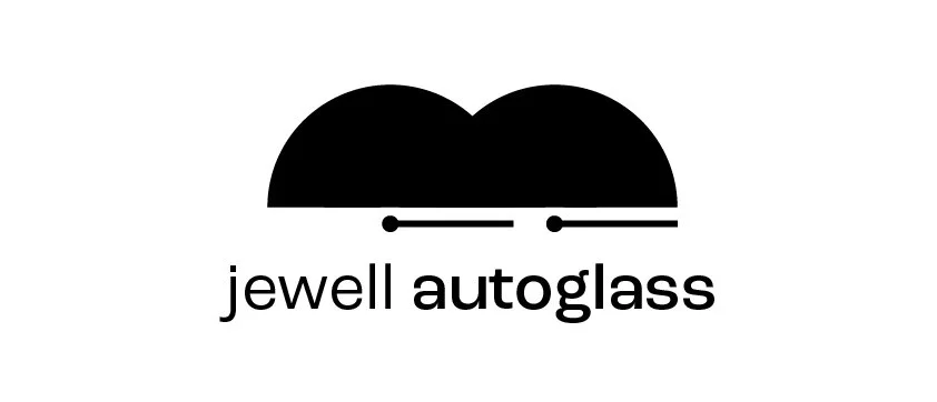


These four were to try different feelings to the brand. The first takes a more minimal luxurious brand, while the next I wanted to reach out to a more Californian oceanfront shop. Bottom left is more the industry standard, and bottom right has a topographical view of a diamond with some type work as just another option.