
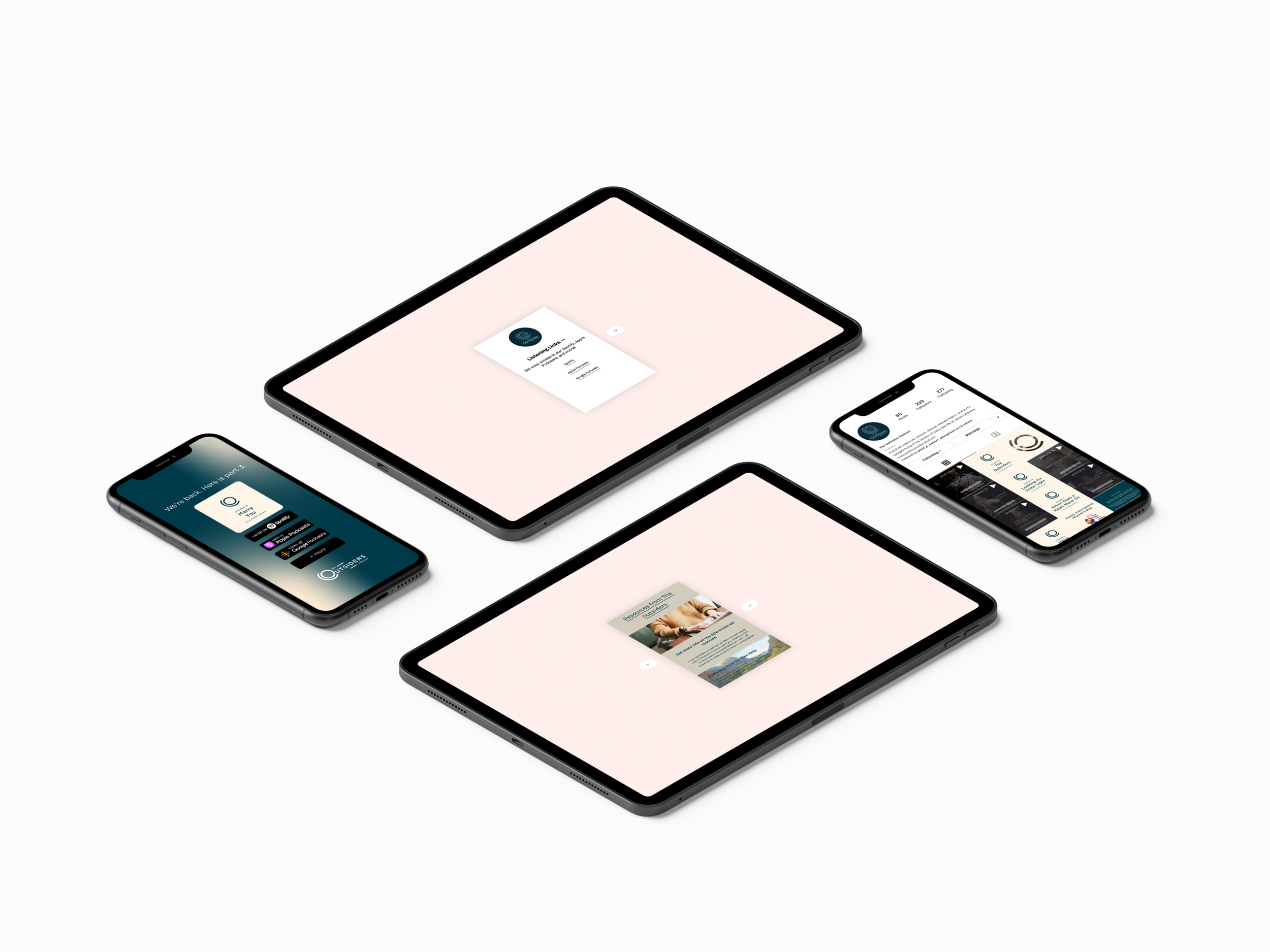
I got the chance to get in the knack of managing a social media account. This is how it went.

It all started with a call from a friend from summer camp. She knew I was a Graphic Designer, and thought to invite me aboard their team. To summarize their brand, it’s a podcast geared to people who want relevant answers to today’s topics from a Christian perspective. More or less.
My job consisted of a few things on a regular basis: make announcements of the new episodes, a highlight in the form of an audiogram giving a soundbite of the podcast, and eventually a landing page with listening links and resources from the episodes. The branding was already taken care of, I just needed to extend it.


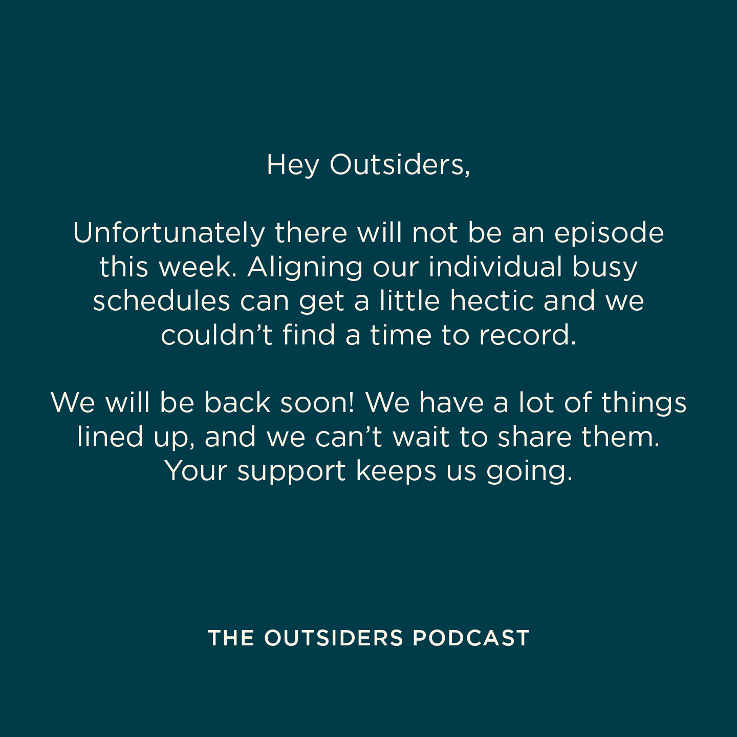
These are some examples of the posts I did. The first is what a typical episode announcement looked like. It was simple in design, but the hierarchy was well established and got the point across. The next was a post for national events, like holidays or celebratory events. Here I had more flexibility and decided to use some stock illustration to add some life and colour. Lastly, were PSA’s that I would post if we needed to take time off from our usual routine.
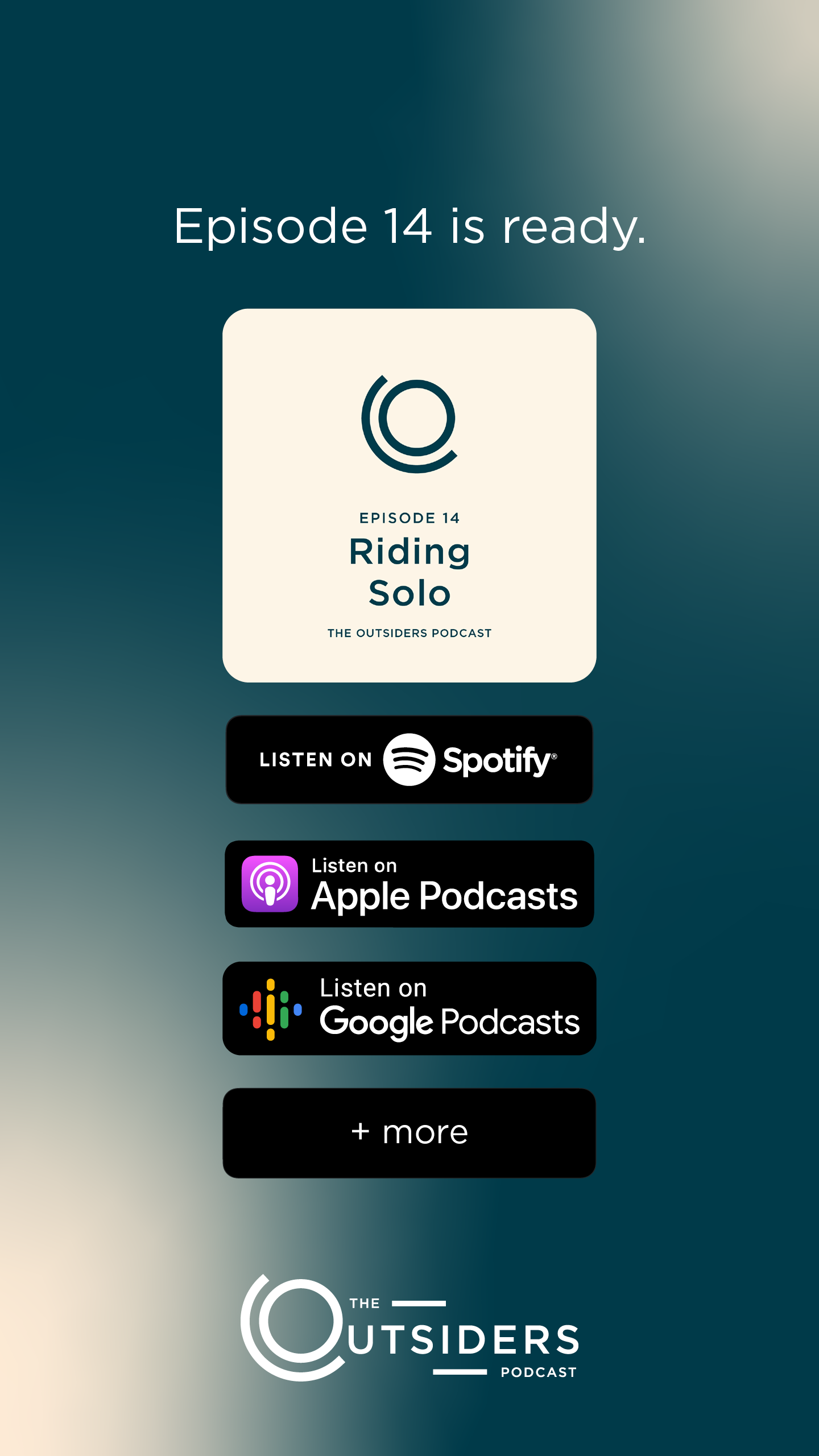
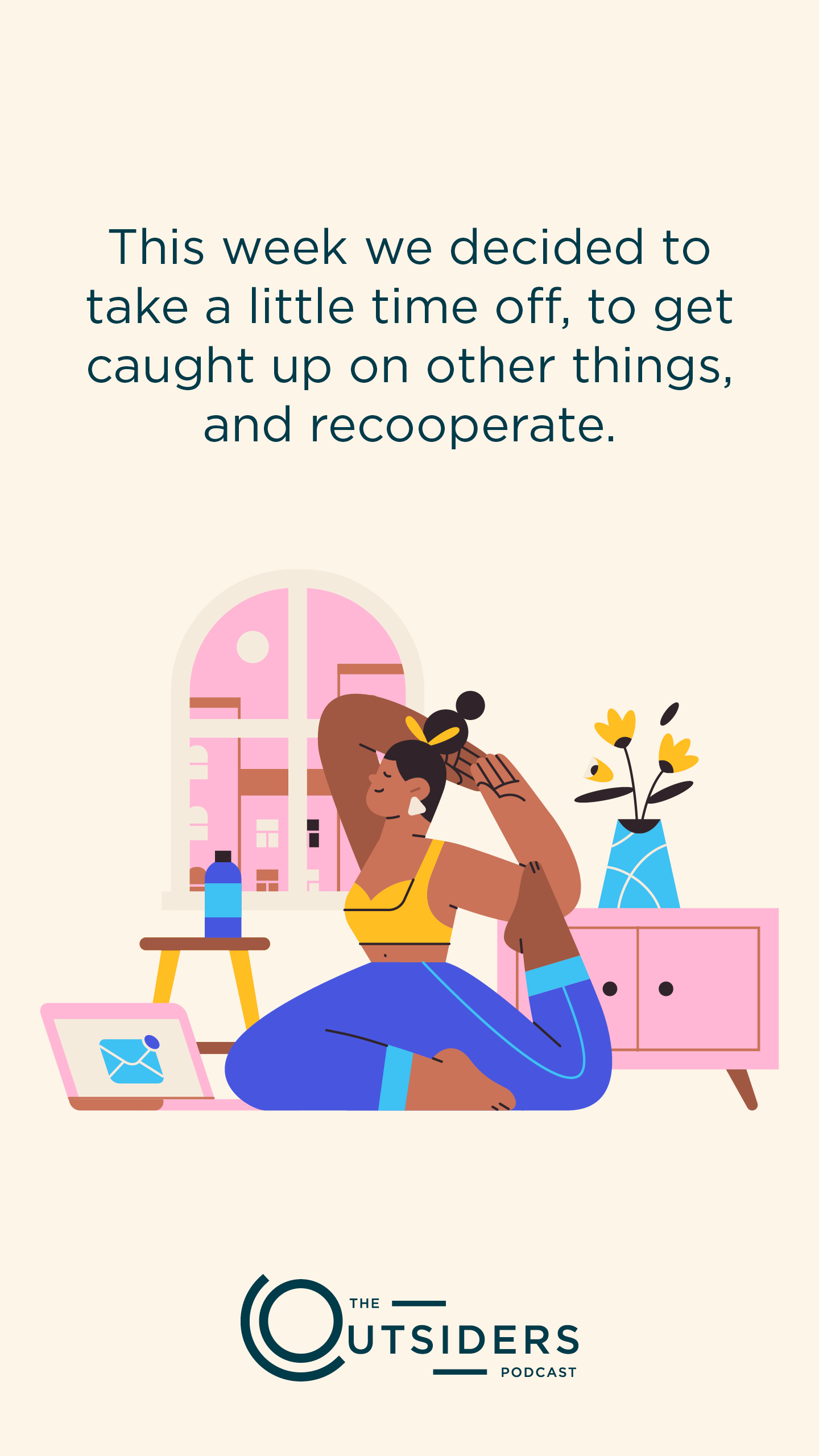
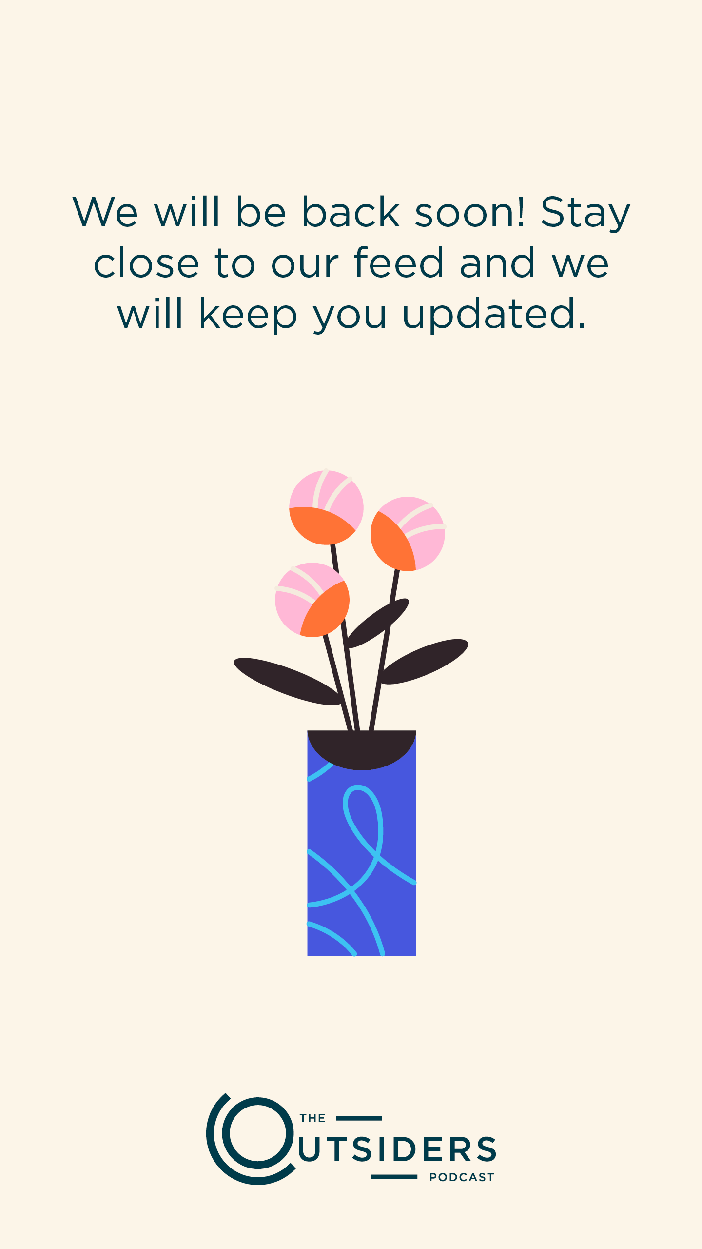
When it came to stories, I wanted to make sure we weren’t just taking a post and sharing it on our story. I think good user experience is found when everything is optimized for its space. So I made sure to use the full 9:16 aspect ratio while still maintaining our simplistic and minimal aesthetic. The first frame shows what a typical episode announcement looked like on our stories. Unfortunately, we didn’t have swiping up accessible to us yet, and the buttons were more informational. The other two show what a typical PSA would look like.

This is what a typical post would be like a couple days after our episode announcement, to help drive engagement and give people a sample of the episode if they had not already listened. While this kind of work could have been done in After Effects, to save on time I used Headliner. Headliner was web-based, meaning I could pick up where someone left off, or vice versa. What was great is the captioning was done automatically, so I would use our template and then fine tune spelling and pacing to make it more natural visually.